

Best AI Graph Generator Tools

Graphs and charts are the best way to visualize data for clear and effective communication. In today’s data driven world all the information is interpreted through graphs and charts rather long and boring spreadsheets.
An AI Graph generator tool automates the process allowing users to create hundreds of compelling and professional graphs from the raw data in no time.
Such a tool simplifies data analysis for users like professionals, businesses and students allowing them to interpret complex datasets into visually apprehensible charts and graphs.
There are numerous AI powered graph generator tools available in the market. You just have to choose a right one depending on its features like customization, ease of use and price.
Let us learn more about AI Graph Generator tools and choose a right one.
What AI Graph Generator Tools Are
An AI graph generator is a kind of software that leverages AI technology to create graphs, charts and other visual representations of data automatically.
They simplify the process of interpreting raw data into easy-to-understand visuals for people from a non technical background.
Such software integrate AI to automate graph creation process, optimize design elements like style, layout and color schemes ensuring visuals are understandable and informative.
For example, if you are an investor in stock market, you can learn more about stocks and their past performances using AI Graph Generator.
What are their Types?
AI Graph generator tools are typically categorized by their functionality. Generally they can be categorized in three categories.
- First one is General Purpose data visualization tools used for creating multiple graphs types for different datasets.
- Other Specialized tools help creating specific chart types like Venn diagrams, bar charts, pie charts, network graphs etc.
- Third category of tools integrates directly with software suites, enabling real time dynamic visualization of data within the platforms.
What They Do
As we discussed early AI graph generator tool analyzes the raw data, generate most relevant visualizations, and recommend optimal layouts and colors for readability.
They identify key data trends, correlations and patterns, interpreting them in a graph or a chart format that are easy to analyze and customize.
Many AI Graph generator tools also offer advanced features like interactive elements, data syncing, and export options, making it easier to share and seamlessly integrate these graphs across other platforms.
How they are Helpful to Users?
There are three big advantages of AI graph generator tools.
- These tools save a lot of user’s time and work by making complex data more apprehensible and visually interesting.
- These tools are very helpful for users who come from non-technical background but are in great need of creating professional graphs. With the help of AI Graph Generator tool they can create professional graphs without learning data analysis or designing skills.
- You can automate the whole visualization process thus creating thousands of high quality informative graphs daily. Moreover these tools enhance data storytelling, making easier for teams to collaborate and communicate insights effectively.
5 Best AI Graph Generator Tools
In my opinion following are 5 best AI Graph Generator tools.
1. ChartGPT
Best Features: ChartGPT (not ChatGPT) uses AI to create customized charts and graphs for both structured and unstructured data inputs. ChartGPT can generate different graph styles like pie charts, line charts, and scatter plots in no time.
Who it’s for: ChartGPT is ideal for every demographics, students, freelancers, small businesses and big organizations.
Pricing: ChatGPT offers a pay-as-you-go pricing model, with packages 500 credits for $4.99, 1000 credits for $9.99, 1500 credits for $14.99
2. DataRobot Paxata
Best Features: DataRobot Paxata offers sophisticated automated data visualization capabilities by providing customized graph suggestions. It detects the data type of each feature. Some supported data types are numeric, categorical, data, text etc.
It gives you 83% faster operationalization of models and 93% faster propagation of analytics capabilities to new areas across the organization.
Who it’s for: Perfect for data professionals, business analysts and large enterprises requiring in-depth data analysis and visualization.
Pricing: DataRobot Paxata is priced as an annual subscription, the average cost is $175,000 annually.
3. Visme
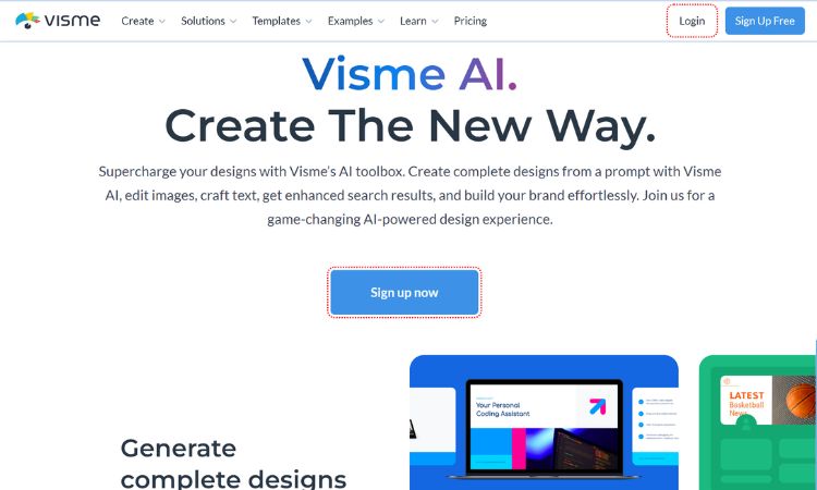
Best Features: Visme software offers features like easy to use templates for presentations and info graphics, built in asset library with icons, fonts, widgets, Data visualization to create charts and graphs and integrate live data, Animation, Collaboration and many more.
Who it’s for: Individuals, businesses, marketers, freelancers looking to create eye-catching presentations mainly for multiple social media platforms.
Pricing: It provides free version with basic features, for advanced functionalities you can go with premium plans starting at $15 per month.
4. Canva Graph Maker
Best Features: Canva is a user-friendly with a drag and drop interface that offers a wide range of templates for creating info graphics, presentations and reports. These professionally designed templates fast-tracks your workflow.
Canva makes data visualization very easy even for a layman with no technical background.
Who it’s for: It better suited for individuals, freelancers, internet marketers and online educators who need visually appealing graphs and charts.
Pricing: Free plan with basic features, Pro Plan is priced at $120 annually for one person.
5. Tableau
Best Features: Following salient features offered by Tableau
- Simple to use Drag and Drop interface
- Real-Time Analytics
- Data Blending
- Natural Language Insights
- Metrics Improvements
- Calculated Fields many more.
Its wide range of customization options make it adaptable for complex data needs.
Who it’s for: Tableau is designed for large enterprises and data scientists who require robust scalable data visualization tools.
Pricing: For Creator’s license Tableau starts at $70 per user per month (when billed annually), which includes Tableau Desktop, Prep Builder and one creator license on Tableau cloud or server.
AI Graph Generator tools simplify the whole data visualization process, empowering users across skill levels from a novice to an experienced data scientist.
You just have to select a right AI Graph Generator tool based on parameters like usability, customization and pricing, to unlock its full potential.
These tools will take your data storytelling to a whole new level.
Suggested reading


Frequently Asked Questions
What is an AI graph generator?
It is software that uses machine learning and heuristics to suggest chart types, layouts, and styling from your data so you spend less time formatting and more time interpreting trends.
Are AI chart tools accurate?
They speed up exploration but you should still validate aggregations, axis scales, and sampling—especially for business or compliance use. Export and peer review remain important.
Which tool is best for beginners vs enterprises?
Beginners often start with template-heavy tools like Canva or Visme; teams doing heavy analytics may combine specialized prep (e.g. Paxata-style wrangling) with enterprise BI like Tableau.
Live masterclasses
Enroll in our live masterclasses programs: Build real AI agents or your first data-science model with expert mentors.
Agentic AI Developer Bootcamp
Structured agentic AI and LangGraph training — intensive bootcamp-style projects with mentor support.
Duration: 2 days, 5 hours each day.
Explore Agentic AI Course →Data Science Masterclass
Start your data science journey with a structured live masterclass and hands-on model building.
Duration: 2 days, 5 hours each day.
Data Science Masterclass →